Categories
Design Featured

Pantone Color of the Year 2020 is Here and We Are SO Blue

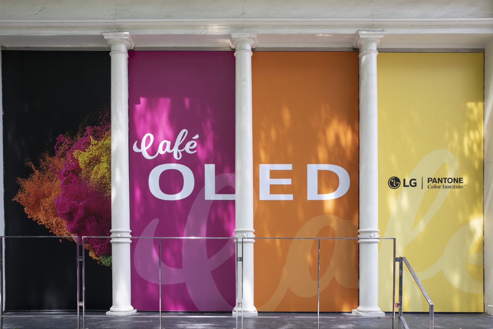
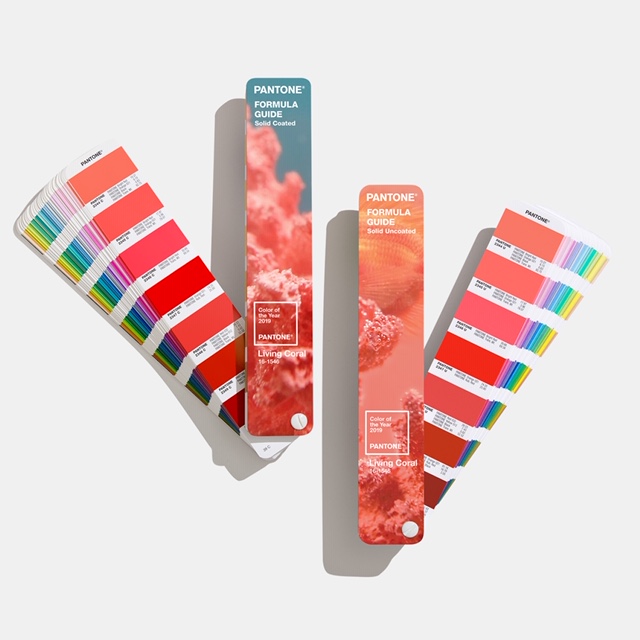
The Pantone color of the year 2020 has arrived, and it is Classic Blue. More specifically, it is Pantone 19-4052, and we are all about this calming, elegant shade. For the past 20 years, Pantone has selected a color based on trends in art, interior design, fashion, automotive manufacturing, and tech, and this year they chose a reliable color, popular the world over, to offset the unrest in the world during these trying times. Leatrice Eiseman, executive director of Pantone’s Color Institute says, “When we look at the world around us, we know that we’re living with a lot of unrest, where some days we don’t feel quite as secure. Blue, from an emotional, psychological standpoint, has always represented a certain amount of calm and dependability. It’s a color that you can rely on.”

Martin Kesselman of INCOLOUR

Color expert and Downtown entrepreneur Martin Kesselman (INCOLOUR) says, “When times are a struggle, call on old reliable. Dress yourself, your space, your world, in that staple color suite. Decorate it with white clouds or a crisp top. Accent it with a brightly painted contrasting ceiling or skirting. Take a step outside, out of your box, out of your dwelling, out of your head. Return to nature and look up in sky for a sign of hope. Ironically, blue can be perceived as cool but it can also be heartwarming. The cure for a case of the blues seems to be Pantone Color of the Year 2020, Classic Blue.” He continues, “Our state of mind, and the State of the Union is looking bleak. Let’s go from seeing red and running hot to embracing blue.”

Larq in Monaco Blue
Larq in Monaco Blue

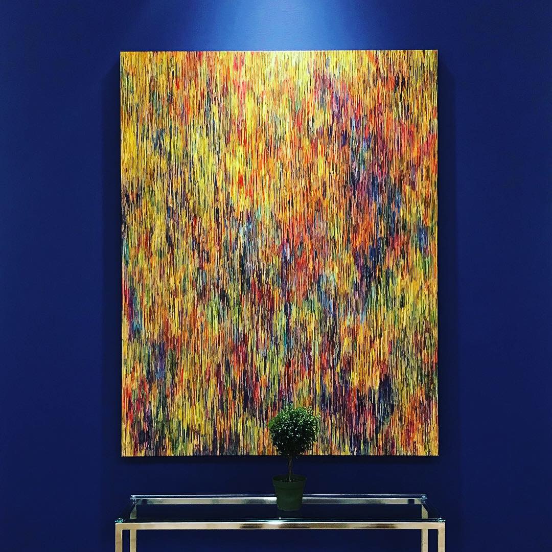
Product designers have always embraced the color, which works in modern, contemporary, and traditional settings.

Pantone Color of the Year 2020
Vincent Darre Chair from The Invisible Collection

You can add Pantone Color of the Year 2020, Classic Blue, with some of our favorites from Larq, Tom Dixon, and The Invisible Collection.

Tom Dixon pillow
Tom Dixon Pillow

Our editors agree, Pantone Color of the Year 2020, Classic Blue, is the perfect addition to your wardrobe and your home.

Categories
Culture Design Events Technology

LG and Pantone sponsor a color-ific weekend pop-up in SoHo!

Technology and color merge in Cafe OLED, a three-day pop-up in SoHo, presented by LG and Pantone Color Institute. To show off the critically-acclaimed OLED TV by LG, the space is decorated using the Summer 2019 trending colors of Pink Peacock, Tangy Turmeric, Aspen Gold, and Pepper Stem.

Cafe’ OLED by LG (Andrew Kelly/AP Images for LG Electronics USA)

Pantone describes its color selections, which are showcased throughout the space:

PANTONE 18-2045 Pink Peacock – The tantalizingly theatrical Pink Peacock emanates excitement, exerting a youthful and whimsical force and conveying a message of having fun with flair.

PANTONE 15-1264 Turmeric – Outgoing and spontaneous with a touch of tang,Turmeric positively glows. Infused with energy and magnetism, Turmeric’s self assurance and warming presence is winningly appealing.

PANTONE 13-0850 Aspen Gold – Exuding the warmth and splendor of the sun, Aspen Gold brightens the day. Radiating hope and happiness, the inviting Aspen Gold stimulates feelings of joy.

PANTONE 17-0542 Pepper Stem – Zesty yellow-green Pepper Stem encourages our desire for nature’s healthy bounty. Connected to newness and growth, a fertile green that speaks to reinvigoration and replenishment.

Café OLED will marry the billion-plus colors on LG OLED TVs with colorful artisan pastries designed by Amirah Kassem, cookbook author and founder of Flour Shop. Inventive tinted lattes will also be served, allowing consumers to see and taste color in a new way. Cafe OLED brings new meaning to the phrase, “Taste the Rainbow.”

Cafe OLED cakes by Flour Shop for LG
Cafe OLED by LG (Andrew Kelly/AP Images for LG Electronics USA)

The LG OLED series flat-screens display color on a background of perfect black, bringing out the richness, depth, and vibrancy of each color. Throughout the pop-up cafe, OLEDs will be showing off vibrant and impressive digital art by illustrator and artist David McCleod.

“At Café OLED, we want consumers to see extraordinary color like they’ve never seen before, and we want to show them on the ultimate canvas, LG OLED TVs,” said Michelle Fernandez, senior director of home entertainment brand marketing at LG Electronics USA. “LG OLED TVs deliver over a billion rich, accurate colors so partnering with the Pantone Color Institute, an organization that is dedicated to opening up the world to the power of color, is an absolutely perfect color match.”

Cafe OLED is located at 386 West Broadway (between Spring and Broome Streets), and is open to the public through July 14, 11am-5pm.

Cafe OLED by LG (Andrew Kelly/AP Images for LG Electronics USA)

Categories
Design Lifestyle Uncategorized

Pantone Color of the Year 2019 is Living Coral

Pantone has announced its color of the year for 2019, and it is Living Coral. It’s an interesting choice because it seems to echo the mood we are in now: swimming in optimism, diving into change, doing our part as citizens, through charitable causes, activism and as designers with thoughtful engaging work.

It seems this year that instead of seeing red in ultraviolet and being stuck in uncertainty, we are working on change collectively, wearing these peachy vibes around town in style, and appreciating them in the home. Living Coral leans towards a life filled with tranquility, warm vibes of calm, it brings a sense of sanity and spiritual healing.

As far as design, the Pantone Color of the Year pairs well with fresh breathable blues and serene greens, close in tone, a bit of a contrast in color. Coincidentally about a 2 years ago I created a coral colour to use in my own bedroom because I wanted to create a warm softness that surrounds for my girlfriend, to offset and balance our busy life. I’m very pleased to see this color popping up now. I am a man of monochrome in my designs and used that style in our room as well. The pink and orange hues are not only on the walls but extended around the base skirting and up the ceiling, to create a feeling of being in the midst of something ephemeral, wrapped in cotton candy. It’s warm and playful without being overly sweet, and it has an airiness to it that really feels right. It’s a restful, rejuvenating place.

As an enthusiast of art history, I find this interesting—the prominent trendsetters and influencers, the colors of the year, all of this has led to mini-moments in time and they are period pieces in their own right if you look back at them. It’s fascinating how fluid things are—we are all watching trends unfold in real time, especially on social media. Influencers in the design world have a responsibility to champion good design and innovation, and colour is an excellent way to inspire. Looking back over the popular or trending colors can be very instructive about people’s feelings and emotions. Pantone Color of the Year: Living Coral feels very much of the moment. It has depth and sophistication but at the same time, it is filled with positivity and light. Maybe that is where we are going as a nation. I’m hopeful INCOLOUR!

Martin Kesselman at Holiday House, photo by Rio Hamilton

Martin Kesselman owns INCOLOUR, a celebrated Colourshowroom and paint shop in TriBeCa. He consults, collaborates, and also sells product. For Kesselman, “Colour is art; Colour is style.” What began as a creative expression transformed into a distinguished profession. He has pioneered a new discipline in interior design as the color expert. Leading interior designers, architects, Fortune 500 companies, and discerning homeowners have relied on his color expertise and design vision.100 Lafayette Street (corner of Walker), NY NY 10013 www.INCOLOUR.life

Categories
Fashion

Top International Fashion News From TheTrendSpotter

TheTrendSpotter
TheTrendSpotter is one of the top authorities out there when it comes to fashion reporting. Earlier this week, the Australia-based site put out another round-up of international fashion news, which is absolutely worth your time.

Among this week’s headlines and highlights:

– A hijab-wearing model walks for Kanye West’s fashion line Yeezy

– IMG signs Stranger Things actress Millie Bobby Brown

Mango unveils a new sustainable committed collection

– London Fashion Week and Pantone commemorate the late Richard Nicoll

– Samantha Cameron’s fashion label Cefinn launches

More details can be found at http://bit.ly/2lf1Qwc.

Categories
Fashion Uncategorized

Menswear In Marsala

Marsala Pantone

Pantone, the color institute, has selected “marsala” as the color of the year for 2015 – which is a good thing for menswear.

Every year since 2000, Pantone has been designating a color to express what they think is taking place in the global zeitgeist – a color that they believe is a reflection of people’s mood, attitude and feeling for 2015. This year it’s a muted scarlet that brings to mind earthy, rich, full-bodied qualities. But of course not everyone agrees.

When the color was announced last week social media was abuzz, with some bashing the color choice as ugly and renascent of bodily fluids, dirt or rust. Everyone’s entitled to their opinions, of course, but as far as menswear is concerned, I think it’s an excellent choice and a great color to add into your wardrobe.

I don’t recommend trying to dress head to toe in the muted burgundy, rather add a pop of it here and there with a scarf, tie, blazer, sock or even a pair of jeans.

-Nicola Harrison Ruiz*

*Nicola Harrison Ruiz is the Men’s Fashion & Lifestyle Editor at DOWNTOWN Magazine. She is also the founder of Harrison Style – a men’s style consulting business. If you want to take your style up a notch, you can find her at www.harrison-style.com. Or email at Nicola@dtnycmag.com.

Marsala has been selected as the 2015 Pantone Color of the Year.

 Pictured clockwise from top left:

J Brand Kane Twill trouser in Saddle, $176 www.jbrandjeans.comMosaic Wool Scarf, $59.50 www.jcrew.comDeath to Tennis Nivan Wool Blazer, $529 www.odinnewyork.comPaolo Albizzati Floral, Medallion Pocket Square, $85 www.barneys.comTie Bar Stripe Tie, $15, www.nordstrom.comO’Keeffe Wingtip Brogues, $965 www.mrporter.com


Marsala has been selected as the 2015 Pantone Color of the Year.

Pictured clockwise from top left:

Goorin Bros Jack Angel Hat, $38 www.goorin.com, Saint Laurent Mini Dot Tie, $185 www.farfetch.com, Gant Rugger Jacquard Sweater, $175 www.us.gant.com, Gallo Woven Bicolor Socks, $37.81 www.farfetch.com8.15 August Fifteenth Newsboy Jacket, $630 www.odinnewyork.com, Charles Tyrwhitt woven tie, $29 www.ctshirts.com