Painter, artist, and author Kelly Fischer has been a woman between worlds since she was 22 years old. More specifically, the day that the 22-year-old college student from Memphis met a young Swiss man on the second day of her study abroad. They got married, and she decided to stay. Since then, Fischer has spent her time split between Bern, Memphis, and New York City. Today, she works to define the differences between her worlds, and the similarities that link them, through her painting. Her current exhibition, Blending Worlds, is a combination of pieces that seek to articulate the feel and energy of her favorite parts of Downtown Manhattan and her home in Switzerland.
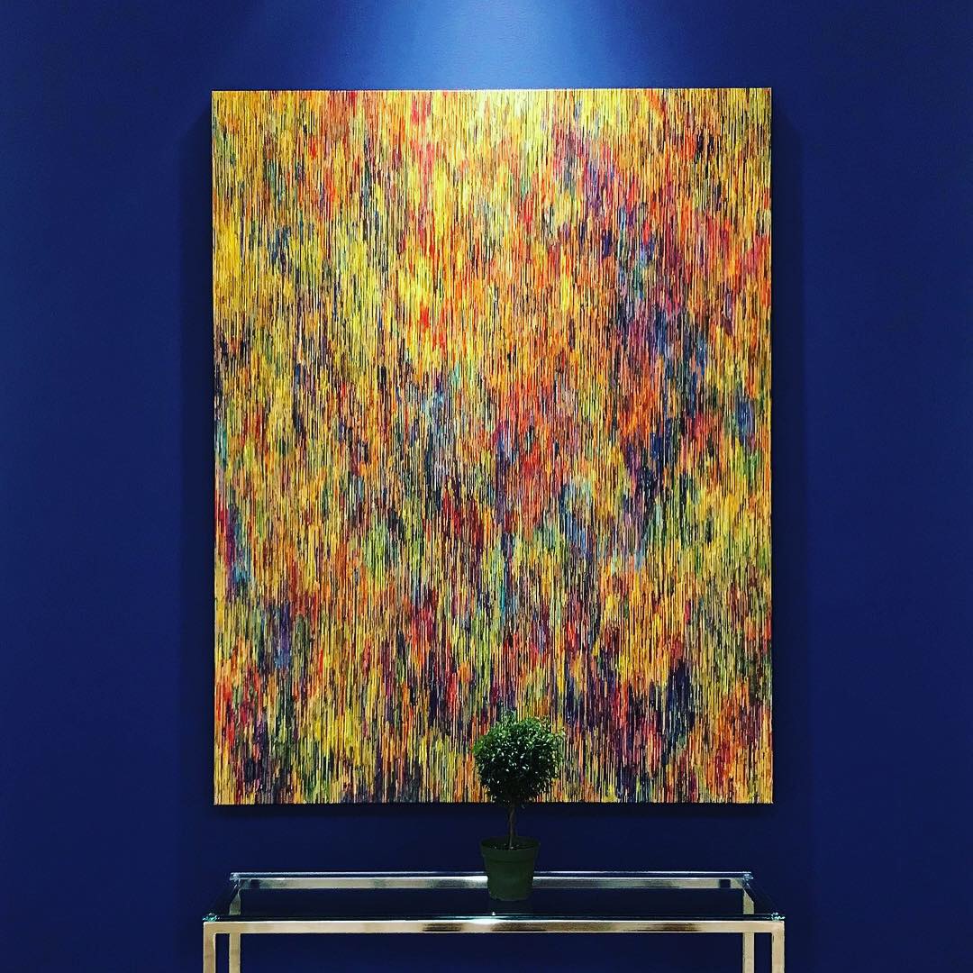
Blending Worlds is a combination between her Street Art series, inspired by NYC, and other pieces inspired by her time in Switzerland. Each piece of abstract art tries to capture the culture, energy, and interactions of the people wherever she goes. Especially the interactions; her goal, she says, is to make the lines and the colors so cohesive that everyone feels included. “It’s about connection. The lines, the circles, everything has to connect with each other.”

Before her professional career as an artist, Fischer was an educator and administrator at a Montessori school in Switzerland. She started her professional career in the arts by creating children’s books–she has written 12 to date–blending two more worlds. Eight years later, she quit her education job and became a professional painter and children’s book author. She has blended those worlds as well, with an interactive exhibition of her best selling book, “The Most Beautiful Color of All.”

Much of Fischer’s current exhibition came from her Street Art series, which draws on the souls of different downtown neighborhoods. Each one, she says, inspires her a different way, affecting her style. Avenue B, in the East Village, was colorful and lively, with a lot of movement. “The East Village felt like there were no rules,” she said, which inspired her to push her artistic limits and try new things. Tribeca’s energy, she said, felt more like Switzerland. “People don’t think out of the box as much.”

For Fischer, Downtown Manhattan is a home away from home. Seven years ago, shortly after she became a full-time artist, she stayed on Perry St in the West Village. She still gushes about it today. “It felt like home, and I knew that I wanted to spend more time there.” And she has, but she hasn’t limited herself to Perry St. She splits time between the West Village, East Village, Bowery, SoHo, and Tribeca. Cipriani’s is her favorite restaurant, and she loves the Bowery Hotel, especially the lobby. “It is the style of me.”

The exhibition’s host, the Swiss Consulate, is especially meaningful to Fischer, and her art. For the first time, she gets to express her two worlds, and she gets to do so in a building that does the same. After this show ends, catch Kelly Fischer in Madrid or Toledo for her next shows, or back in Downtown Manhattan for a short documentary exploring the influences behind her street art series through six exhibitions in four countries. The film was accepted at NYC International Film Festival and East Hampton TV Art and Film Festival.