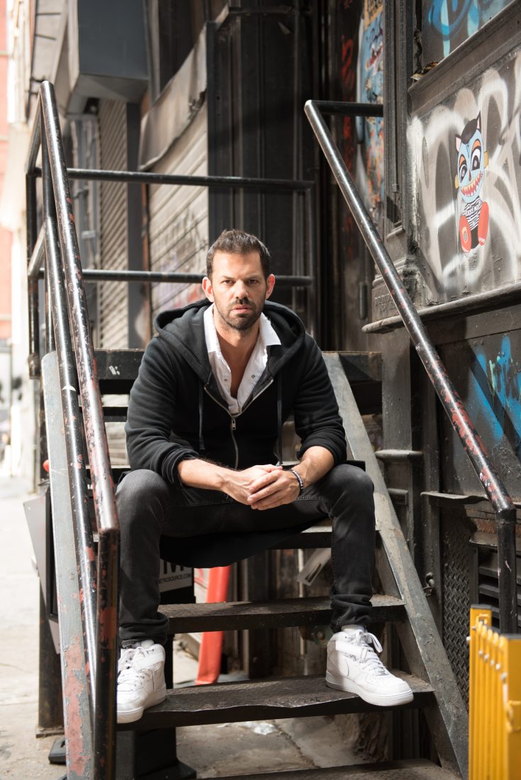
AT HIS TRIBECA SHOWROOM, INCOLOUR Martin Kesselman leads in color coaching his clients, helping them select a color palette that reflects their lifestyle, personality, and space. “We are really trying to create a story or mood for their space.”
As a native New Yorker, Kesselman had a front row seat to the city’s ever-evolving art scene, especially within his childhood neighborhoods, Chelsea and Brooklyn. “I always had the drive to be creative but I never wanted to be a struggling artist, so I became an entrepreneur in color,” he says. He developed a fascination for design while working at art galleries in lower Manhattan. “I got to know some of the art collectors and was intrigued by how they were displaying big contemporary art in a gallery-esque way in their homes,” he explains.
TriBeCa, he says, is undergoing an art movement. “This is the next place it is going to happen. I like a little grit, I like diversity, and I think it’s inspiring to be around all of these artists. I still consider myself one. I still like getting my hands dirty.”
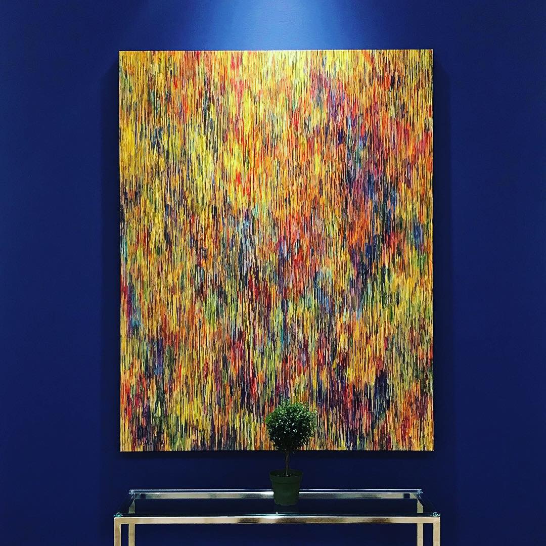
Kesselman’s showroom is part gallery, part workshop, part traditional paint store, and color drives the aesthetic. The storefront is equipped with workspaces to invite designers, architects, and clients to work alongside him when evaluating color. “The house of color, as I sometimes call it, has the best of the best,” he says. “I wanted other designers to come and bring clients, fabrics, plans, and to spend time with me and utilize my color tools. It’s not often that you can walk in off the street and speak with a design professional and get expert advice.”
Kesselman is adept at creating moods by playing with finish and texture in addition to color. He also utilizes areas that are often overlooked like the ceiling, “the 5th wall.” He uses color to not only complement the art inside homes but to create it himself. His passion for his subject is all-encompassing—from designing interiors to imagining entirely new colors in his role as ambassador with luxury paint brand Farrow and Ball. His latest creation, Elliyah, is a peaceful, nuanced white, an antidote to the frenetic pace of downtown living. This dreamy hue is a reminder to clients—and Kesselman himself—to slow down.
Peace and livability are two ideas Kesselmen stressed in creating a new set of Fine Paints of Europe colors tailored specifically for Downtown living. These selections contrast the busy and lively streets of New York with comforting neutrals. “Some colors are complex and living with them is a more active experience. This is about finding balance,” Kesselman says. “People have busy lives, myself included, and sometimes you just want to escape, or you want to go home and feel serenity. That’s what I want for my clients, to have a pleasant and happy experience.”
To see how Martin Kesselman leads in color coaching, visit incolour.life.


