Categories
Design Featured

Martin Kesselman Leads in Color Coaching

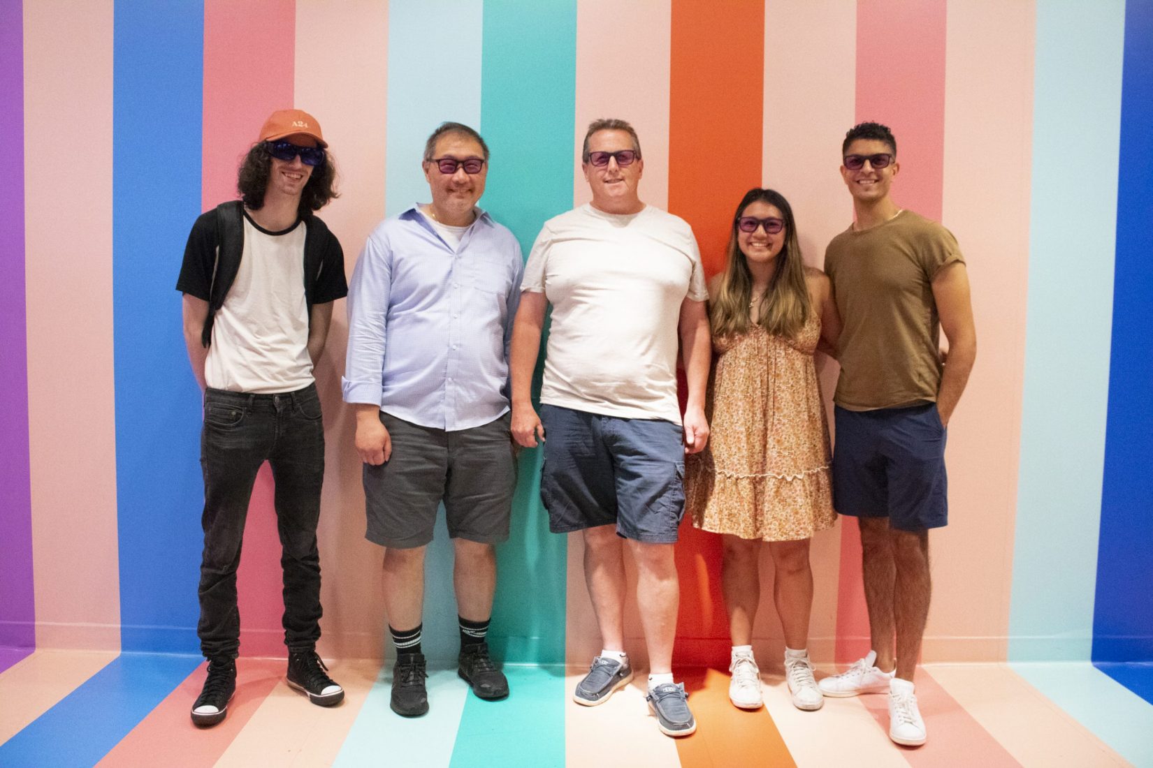
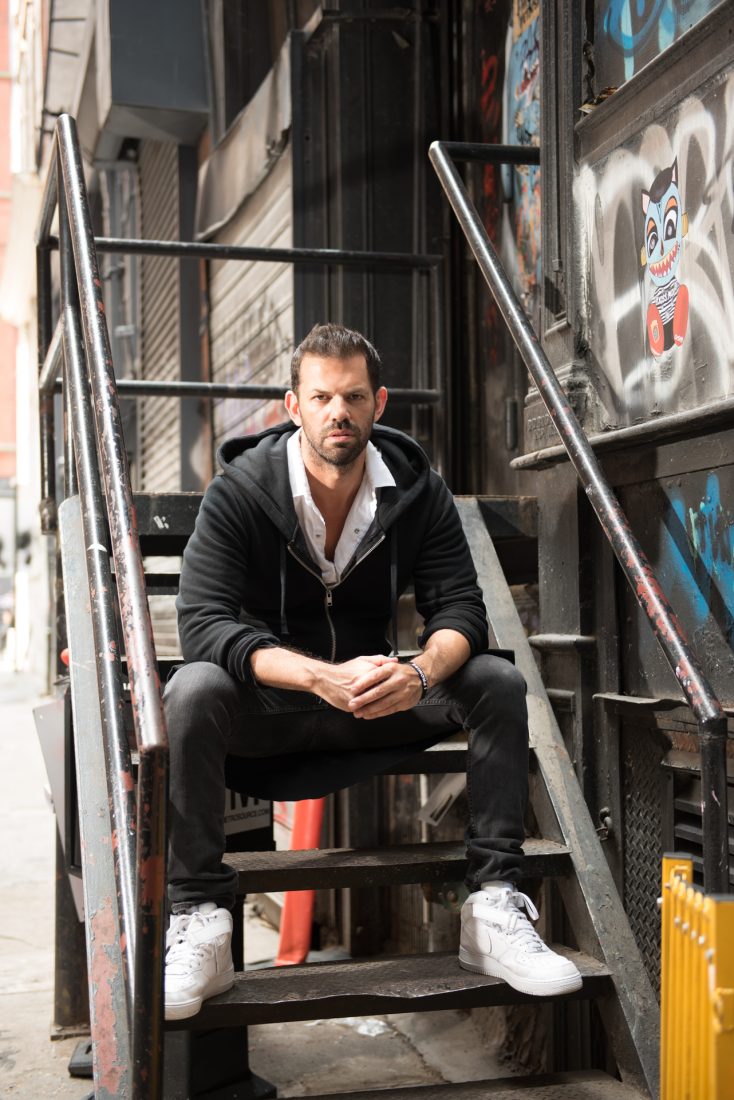
AT HIS TRIBECA SHOWROOM, INCOLOUR Martin Kesselman leads in color coaching his clients, helping them select a color palette that reflects their lifestyle, personality, and space. “We are really trying to create a story or mood for their space.”

As a native New Yorker, Kesselman had a front row seat to the city’s ever-evolving art scene, especially within his childhood neighborhoods, Chelsea and Brooklyn. “I always had the drive to be creative but I never wanted to be a struggling artist, so I became an entrepreneur in color,” he says. He developed a fascination for design while working at art galleries in lower Manhattan. “I got to know some of the art collectors and was intrigued by how they were displaying big contemporary art in a gallery-esque way in their homes,” he explains.

TriBeCa, he says, is undergoing an art movement. “This is the next place it is going to happen. I like a little grit, I like diversity, and I think it’s inspiring to be around all of these artists. I still consider myself one. I still like getting my hands dirty.”

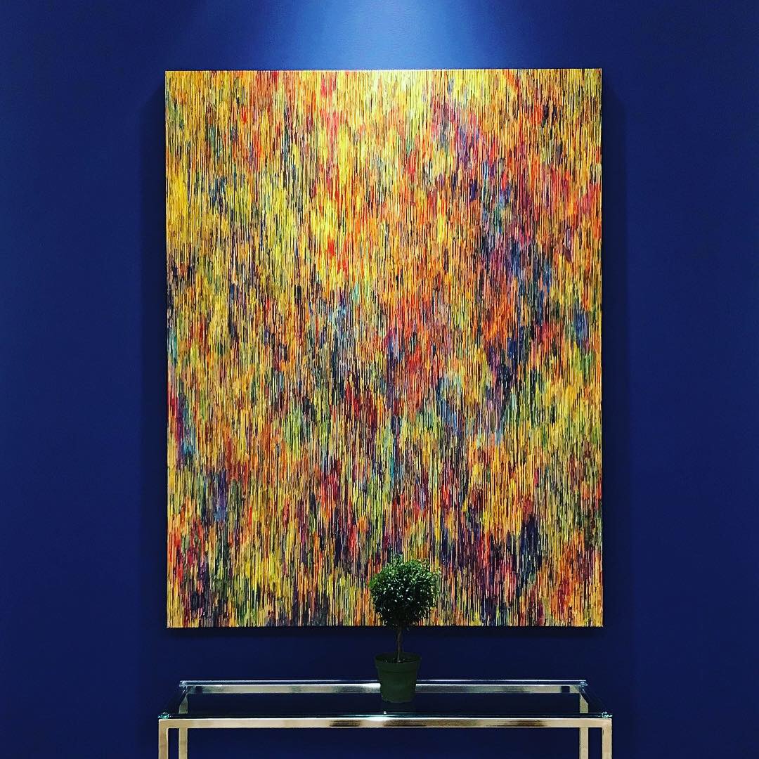
Kesselman’s showroom is part gallery, part workshop, part traditional paint store, and color drives the aesthetic. The storefront is equipped with workspaces to invite designers, architects, and clients to work alongside him when evaluating color. “The house of color, as I sometimes call it, has the best of the best,” he says. “I wanted other designers to come and bring clients, fabrics, plans, and to spend time with me and utilize my color tools. It’s not often that you can walk in off the street and speak with a design professional and get expert advice.”

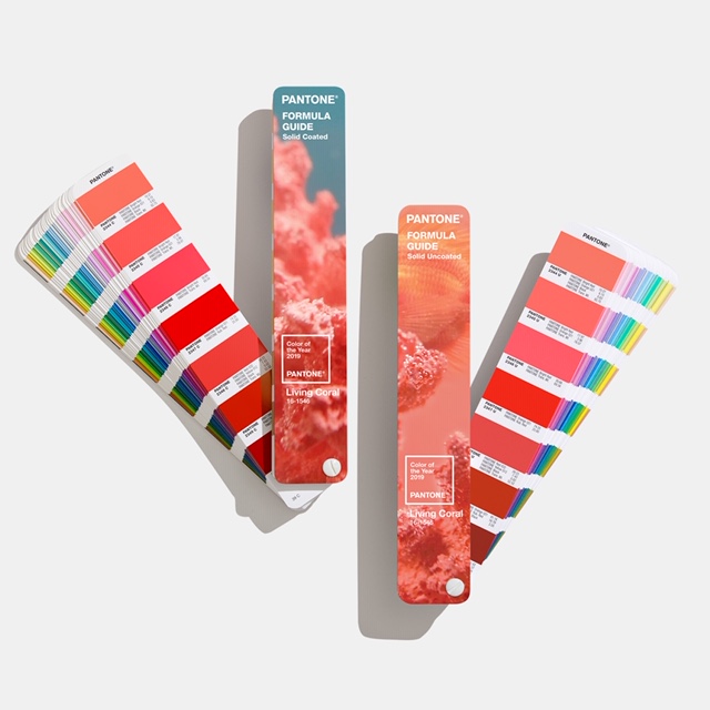
Kesselman is adept at creating moods by playing with finish and texture in addition to color. He also utilizes areas that are often overlooked like the ceiling, “the 5th wall.” He uses color to not only complement the art inside homes but to create it himself. His passion for his subject is all-encompassing—from designing interiors to imagining entirely new colors in his role as ambassador with luxury paint brand Farrow and Ball. His latest creation, Elliyah, is a peaceful, nuanced white, an antidote to the frenetic pace of downtown living. This dreamy hue is a reminder to clients—and Kesselman himself—to slow down.

Peace and livability are two ideas Kesselmen stressed in creating a new set of Fine Paints of Europe colors tailored specifically for Downtown living. These selections contrast the busy and lively streets of New York with comforting neutrals. “Some colors are complex and living with them is a more active experience. This is about finding balance,” Kesselman says. “People have busy lives, myself included, and sometimes you just want to escape, or you want to go home and feel serenity. That’s what I want for my clients, to have a pleasant and happy experience.”

To see how Martin Kesselman leads in color coaching, visit incolour.life.

Categories
Events Lifestyle Living Museums NYC Restaurants

A Colorful Experience with EnChroma

On June 26, EnChroma, a lead manufacturer of glasses for those who are colorblind, teamed up with Eataly Downtown for a fun and colorful event. At this event, five color-blind New Yorkers experienced viewing color for the first time. La Pizza & La Pasta A Colori, a restaurant created by the Color Factory and Eataly, provided colorful arrangements of food including wines and cheeses to add to this colorful experience. Some of A Colori’s proceeds will be donated to EnChroma’s Color Accessibility Program. This program donates EnChroma glasses to libraries in New York for color-blind guests.

Expectations of EnChroma Glasses

Many of the guests had mentioned that being color blind makes their classes school or their job more difficult. Steve Brandon, a college student, explained that classes like “Geology in college was definitely a bad experience. Distinguishing the colors of rocks for exams and assignments would always be extremely difficult and I never did too well in the class.” 

Also, participants described having difficulty playing certain color based games, being creative, and picking out outfits. Dr. Samuel Fam, a family medicine physician, explained that he loved to draw as a child “but once color blending became a more advanced skill I shied away from being creative because I couldn’t match shades in natural ways.” The participants hoped that the glasses would make them feel more confident and able to relate to the beauty of color that the rest of the community so easily experiences. 

Thoughts on EnChroma Glasses

The participants adored the EnChroma Glasses! Bob Brown, NYC firefighter and police officer, explained that “the colors [were] just dancing…[the world] is popping with color!” The participants agreed that the glasses do indeed make a huge difference. Peter Fong, a software engineer, exclaimed that this was “a life changing experience.” Delaney Scheidell, a high school student, explained that she’s “excited to go home and experience a new environment”. Eataly now has a permanent set of EnChroma glasses available at their restaurant for color blind customers. 


Categories
Design Featured

Pantone Color of the Year 2020 is Here and We Are SO Blue

The Pantone color of the year 2020 has arrived, and it is Classic Blue. More specifically, it is Pantone 19-4052, and we are all about this calming, elegant shade. For the past 20 years, Pantone has selected a color based on trends in art, interior design, fashion, automotive manufacturing, and tech, and this year they chose a reliable color, popular the world over, to offset the unrest in the world during these trying times. Leatrice Eiseman, executive director of Pantone’s Color Institute says, “When we look at the world around us, we know that we’re living with a lot of unrest, where some days we don’t feel quite as secure. Blue, from an emotional, psychological standpoint, has always represented a certain amount of calm and dependability. It’s a color that you can rely on.”

Martin Kesselman of INCOLOUR

Color expert and Downtown entrepreneur Martin Kesselman (INCOLOUR) says, “When times are a struggle, call on old reliable. Dress yourself, your space, your world, in that staple color suite. Decorate it with white clouds or a crisp top. Accent it with a brightly painted contrasting ceiling or skirting. Take a step outside, out of your box, out of your dwelling, out of your head. Return to nature and look up in sky for a sign of hope. Ironically, blue can be perceived as cool but it can also be heartwarming. The cure for a case of the blues seems to be Pantone Color of the Year 2020, Classic Blue.” He continues, “Our state of mind, and the State of the Union is looking bleak. Let’s go from seeing red and running hot to embracing blue.”

Larq in Monaco Blue
Larq in Monaco Blue

Product designers have always embraced the color, which works in modern, contemporary, and traditional settings.

Pantone Color of the Year 2020
Vincent Darre Chair from The Invisible Collection

You can add Pantone Color of the Year 2020, Classic Blue, with some of our favorites from Larq, Tom Dixon, and The Invisible Collection.

Tom Dixon pillow
Tom Dixon Pillow

Our editors agree, Pantone Color of the Year 2020, Classic Blue, is the perfect addition to your wardrobe and your home.

Categories
Design Lifestyle Uncategorized

Pantone Color of the Year 2019 is Living Coral

Pantone has announced its color of the year for 2019, and it is Living Coral. It’s an interesting choice because it seems to echo the mood we are in now: swimming in optimism, diving into change, doing our part as citizens, through charitable causes, activism and as designers with thoughtful engaging work.

It seems this year that instead of seeing red in ultraviolet and being stuck in uncertainty, we are working on change collectively, wearing these peachy vibes around town in style, and appreciating them in the home. Living Coral leans towards a life filled with tranquility, warm vibes of calm, it brings a sense of sanity and spiritual healing.

As far as design, the Pantone Color of the Year pairs well with fresh breathable blues and serene greens, close in tone, a bit of a contrast in color. Coincidentally about a 2 years ago I created a coral colour to use in my own bedroom because I wanted to create a warm softness that surrounds for my girlfriend, to offset and balance our busy life. I’m very pleased to see this color popping up now. I am a man of monochrome in my designs and used that style in our room as well. The pink and orange hues are not only on the walls but extended around the base skirting and up the ceiling, to create a feeling of being in the midst of something ephemeral, wrapped in cotton candy. It’s warm and playful without being overly sweet, and it has an airiness to it that really feels right. It’s a restful, rejuvenating place.

As an enthusiast of art history, I find this interesting—the prominent trendsetters and influencers, the colors of the year, all of this has led to mini-moments in time and they are period pieces in their own right if you look back at them. It’s fascinating how fluid things are—we are all watching trends unfold in real time, especially on social media. Influencers in the design world have a responsibility to champion good design and innovation, and colour is an excellent way to inspire. Looking back over the popular or trending colors can be very instructive about people’s feelings and emotions. Pantone Color of the Year: Living Coral feels very much of the moment. It has depth and sophistication but at the same time, it is filled with positivity and light. Maybe that is where we are going as a nation. I’m hopeful INCOLOUR!

Martin Kesselman at Holiday House, photo by Rio Hamilton

Martin Kesselman owns INCOLOUR, a celebrated Colourshowroom and paint shop in TriBeCa. He consults, collaborates, and also sells product. For Kesselman, “Colour is art; Colour is style.” What began as a creative expression transformed into a distinguished profession. He has pioneered a new discipline in interior design as the color expert. Leading interior designers, architects, Fortune 500 companies, and discerning homeowners have relied on his color expertise and design vision.100 Lafayette Street (corner of Walker), NY NY 10013 www.INCOLOUR.life

Categories
Fashion

Trends For Fall: Intellectual Color

[slideshow_deploy id=’45283′]

One of the most outstanding trends we’ve spotted for this fall is an intellectual take on color. We have noticed many examples of  the different ways to combine tones and textures. Look for color and fur to emerge as this year’s winning combo.

At last month’s Prada show in Milan, we saw a culturally inspired collection that hinted of a German influence with notes of avant-garde post-modernism art with flowing fabrics that hint both of the movements of dancer Pina Bausch and the visual influences of director Rainer Werner Fassbinder.

The overall presentation of this collection felt more like a political movement than a fashion statement. Miuccia Prada plays with the idea of humanism in all the aspects of life, including love, economy and sexuality. Structured coats covered delicate chiffon and silk dresses that called to mind the ideals of Italian romanticism.

The Marni show in Milan was all about excess. In the words of Consuelo Castiglioni the collection was “The Marni world but more than usual.” The sportiness of the house’s heritage was focused more into a couture feeling that was represented throughout the volumes of the clothes and the ambiguous presentation of the fabrics. The creative tension between the sophisticated lines and the aggressiveness of the color and textures indicated that the modern Marni woman is more confident, more exotic, more sporty and less quirky. There is more passion and as Castiglioni says, simply more and better than usual.

Extreme luxury is always the language of Joseph Altuzarra and for his last collection he didn’t disappoint. Altuzarra is known for bringing a French vibe to New York catwalks. He offered a tailored and richly colorful collection for fall. His refinement of the silhouette was, as always,  über flattering and the hints of pink and orange that contrasted with the gray palette were clearly a statement of structure with a relaxed feel.

Take a look to our picks for top looks that will keep your next winter colorful.

-Paris Amaro.